Three weeks to the day; the time it took for the city to seep in. I recently met a great couple and they asked me to design and build a piece of furniture for their home here in Toronto. The only two guidelines they had for me were to use a darker toned wood and attempt to incorporate some brushed aluminum into the piece. They already have a piece of furniture with an aluminum, decorative inlay and brushed aluminum door pulls. I immediately thought about the aluminum aspect of the piece. As soon as I blended mediums I knew it would have to be more than a simple accent.
Clean straight lines, aluminum and glass, what else says Urban living like this?
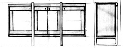
I've always been a fan of the more minimalistic approach to design; the modern movements and European influences. The over-all dimensions were a given due to the space requirements where the piece will be living. A kind of sideboard/cabinet with three sliding doors was my first instinct; but once the pencil went to paper things changed. Things always change from those first initial thoughts to design and then on to construction. Pieces evolve in a natural way, an ordinary process coming round full circle. Ideas seem to blend through the realities of joinery. One thing I want to maintain in the piece is a hand crafted look while still reflecting the machining of this metropolitan landscape. The aluminum aspect was decided on. Two 1 1/4" thick pieces of solid aluminum plating, cut and rounded by means of water jet. These two monoliths will make up the stand/ or legs of the unit; while the wooden carcass will fit perfectly inside the two larger cut-outs in the top portion of the plates.
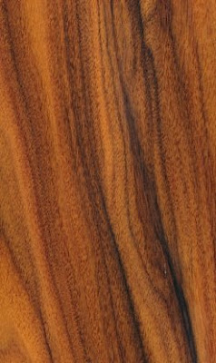
 The wood at this point is still un-decided although I keep thinking PAU FERRO (Santos Rosewood) a dark bodied hardwood that will compliment the hand cut dovetailed box which will make up the bulk of the piece. The cabinet will be divided with two solid panels, isolating three separate spaces within. The doors are another design/construction reality altogether. I know I wanted to have sliding doors but now feel they'll eat up too much interior real estate. I decided on hinged doors incorporating glass panels. The first obvious choice for the door joinery would be a kind of frame and panel. This of course would be the obvious choice; and who could ever be satisfied with that? What I've come up with is a three sided, 'open~frame' and panel; the inside edge of the frame being only glass while the outside of the door solid wood. Full mortise and tenon joinery on the corners, with a kind of suspended glass panel within. A design challenge indeed, but one that will pay off in the final showcase. The interior will also feature glass shelves, securely sitting on Bronze ,threaded support sleeves. A real nice touch to allow the shelves to be adjustable to suit the contents later on.
Again, the initial impression would be three doors to match the three spaces, but now I'm thinking on off-setting the aluminum legs and making one larger middle space, incorporating two doors for it and then carry on with two slightly narrower side areas flanking this first mid-section. Designs can change, re-arrange and why not let them? Sketches and diagrams will only show so much to the hand caressing softened edges of exotic hardwoods later on. At this stage of the game, anything is possible, never limit yourself before you even leave the starting gates. Design for the impossible, dream the unimaginable and then finally settle on the realistic. Stay tuned...
I like your design so far. If I may make a suggestion, have you considered re-proportioning the center section to have a more pleasing width ratio with the end sections? Perhaps 1.618:1 or the golden ratio. I have found the following calculator indespensible when designing my cabinetry and furniture!
ReplyDeletehttp://www.thismanslife.co.uk/main.asp?contentid=phiculator
Thanks Jordan,
ReplyDeleteIf you notice in the end section of the article I am planning on re-proportioning the center section to be wider with the two outer areas a little narrower. The sketch is not updated I'm afraid.
Thanks again for the comments.
Cheers!
Oops, my bad. Well, I hope you find the phiculator useful. Have fun working on the project. I would definitely like to see a photo of the finished piece.
ReplyDeletewill do...and thanks again for the calculator.
ReplyDeleteHey Tom. Great post. I really like your reflection on aspects of design. Congrats on your first urban commission! City people and their love of aluminum!! I like the Pao Ferro choice, but what about Bolivian Rosewood or even maybe Peruvian Walnut? Just wondering. I like the design. It will shine in their abode.
ReplyDelete@Jordan
I use the Golden Ratio a great deal in my designs. Great link to the calculator! I had no idea there was one on the web.
Thanks for the comments and suggestions. I'll consider both options but will wisely leave the final say to my clients.
ReplyDeleteCheers!
HA!! Wise choice!! Yes, I was not insinuating that you should use those wood selections. The client is always the one with the last say!! So true! Thanks Tom.
ReplyDelete